Parts of a Postcard
Our Postcards are Private Postcards and have a selection of the following elements:
- a Front where a picture is generally displayed
- a Back or Reverse that for the last 100 years has been split between
- an area for To: addressing
- an area used for Correspondence
- an area to place a Postage Stamp
- a blank/safe area for actions like Cancellation and Post Marks
- often a Title to the card (although sometimes this is on the front)
- often a mention of the Card Manufacturer, the Manufacturing Process, and Manufacturing Location
- often a mention of the Photographer
- occasionally a Return: addressing area
Previous to these Private Postcards (depending on jurisdiction) most cards were known as Public Postcards. They were government issued and managed, with limited imagery and very peculiar (to the modern eye) addressing and messaging components. I have seen a single copy of this type of Postcard that fits our Beach and Downtown focus and I’d love to put it into the series.
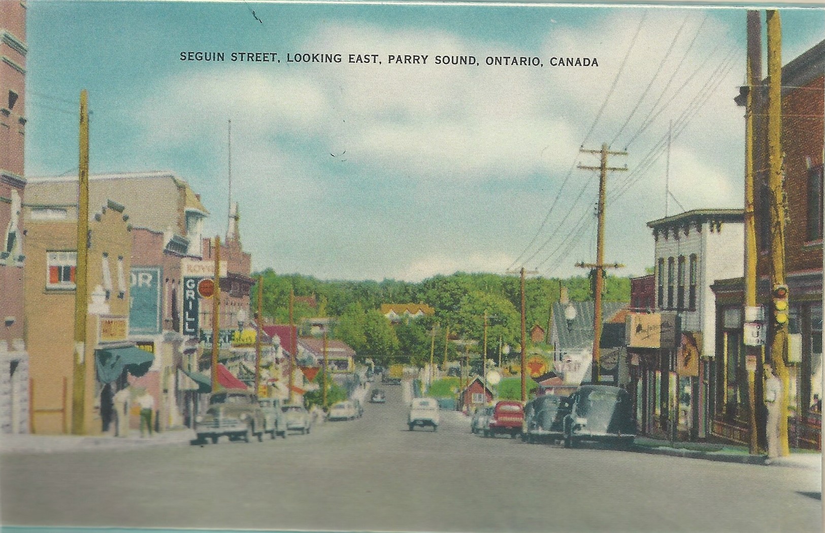
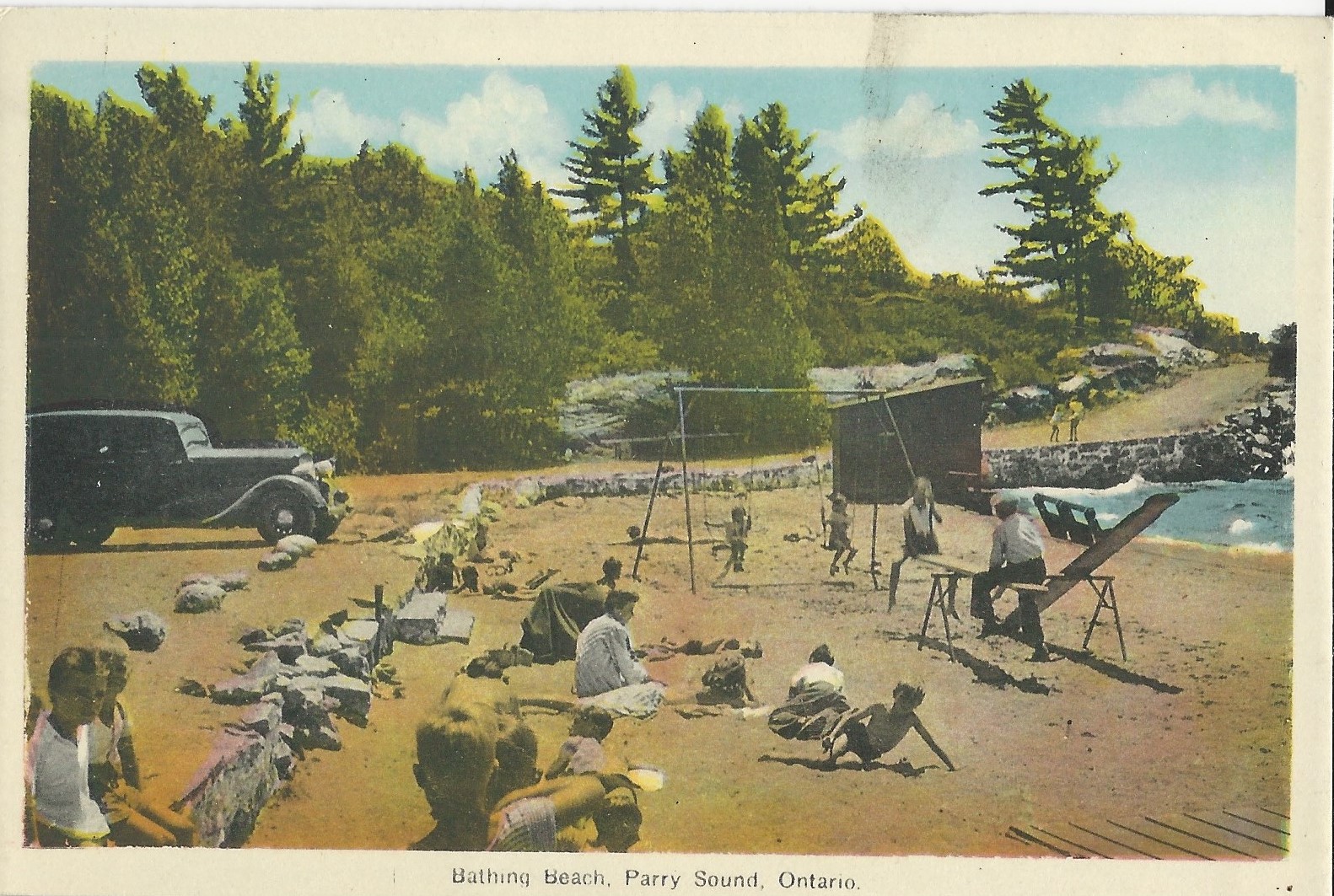
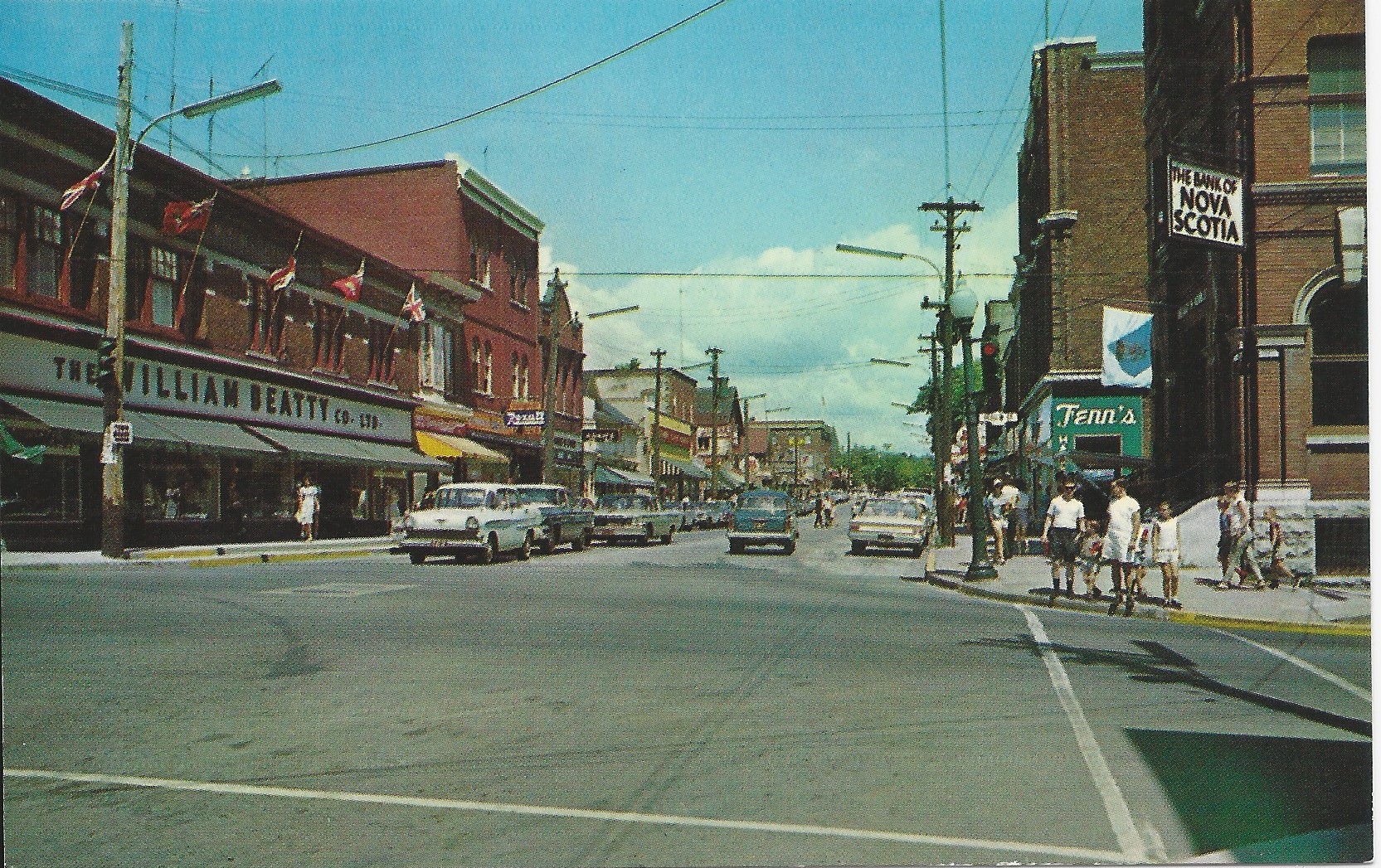
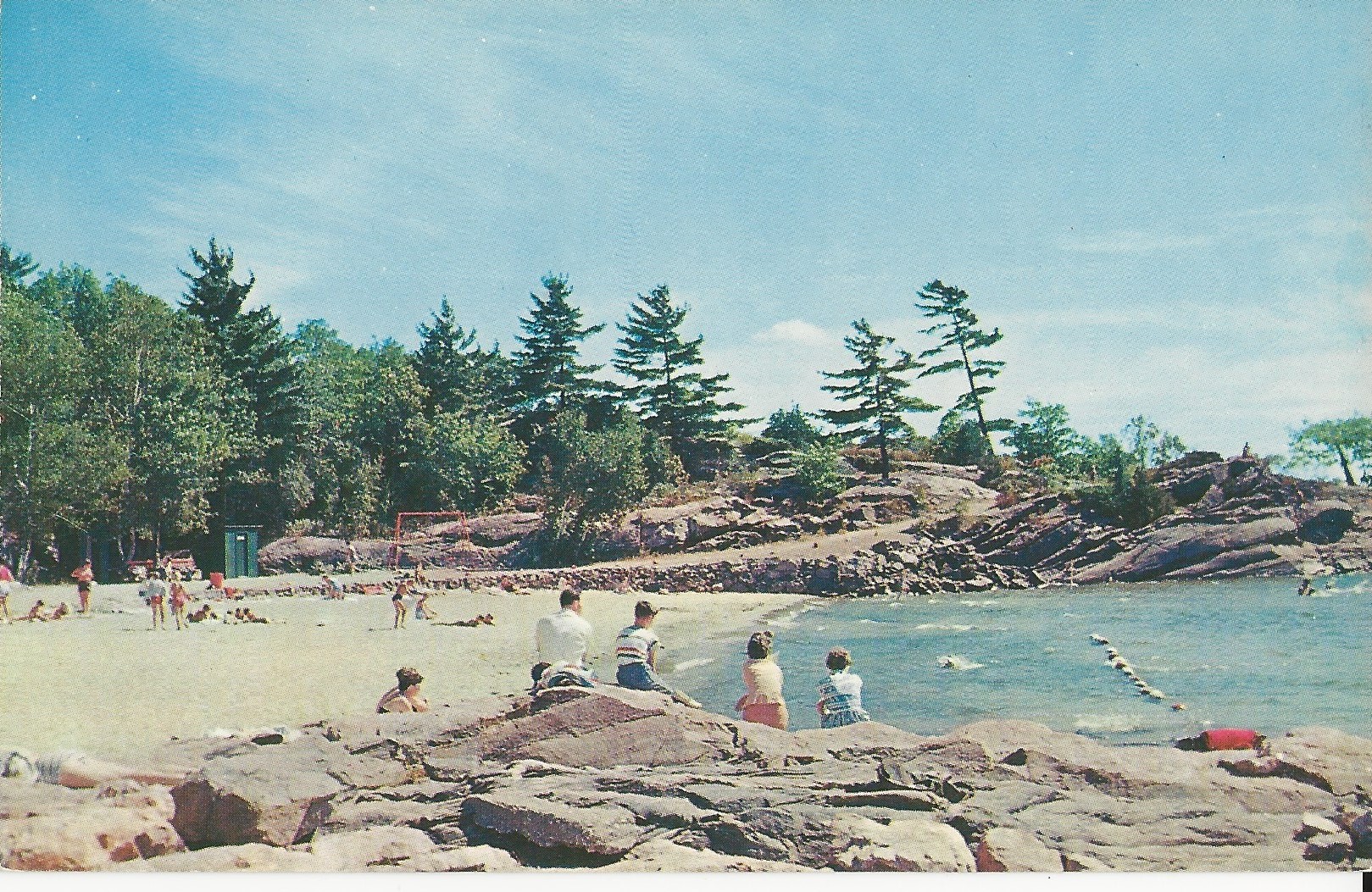
Images we See in Parry Sound Postcards
For all of our cards, a picture, generally a photo, is on the front. Broadly, our photos have been manufactured in four manners:
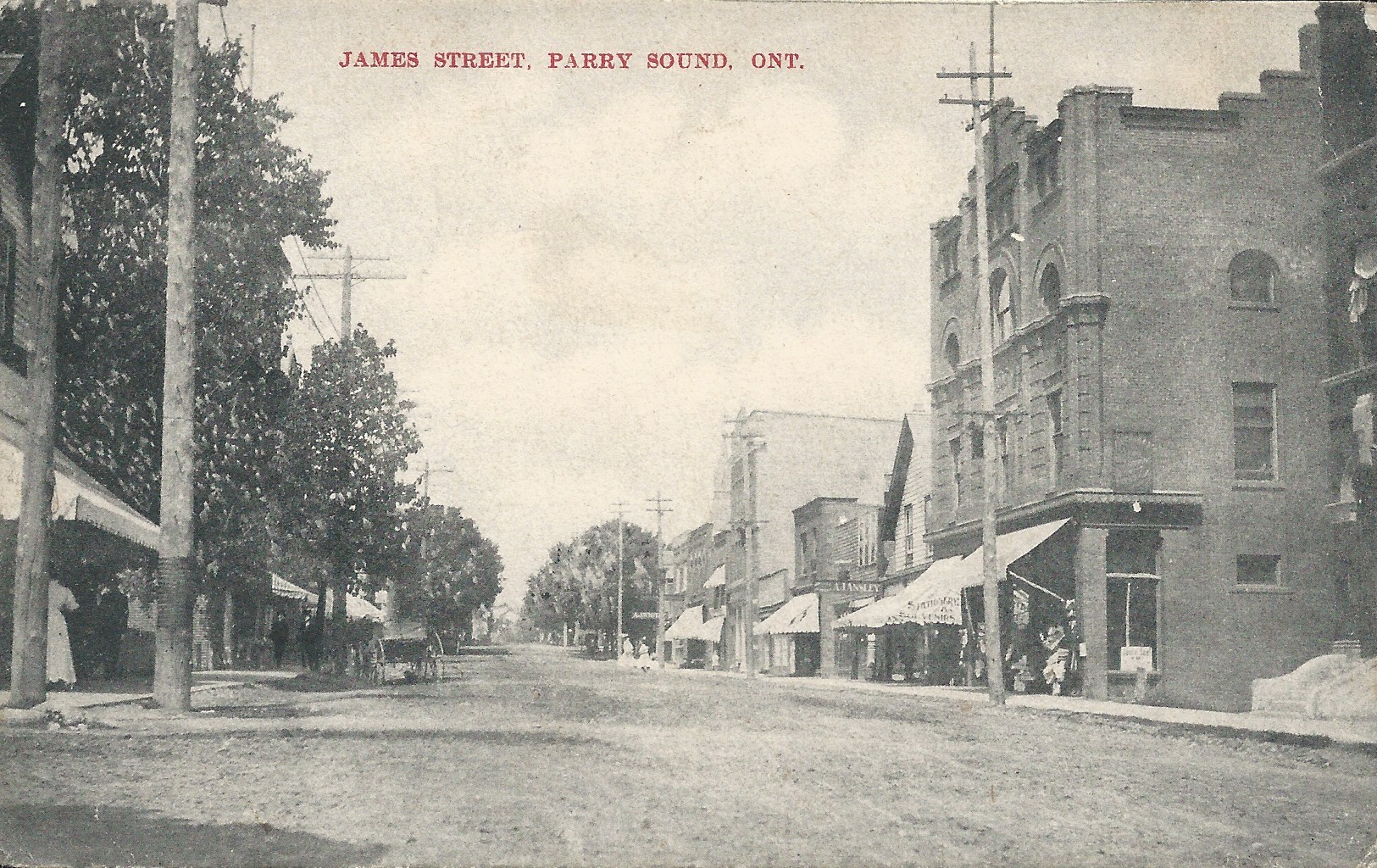
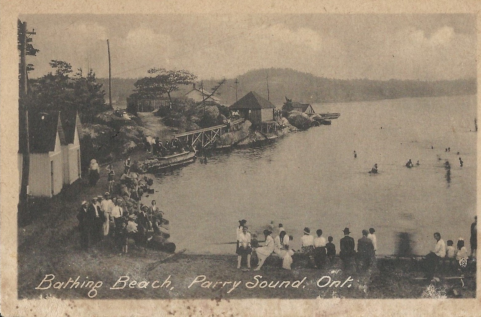
- a black and white reproduced photo (but to be clear not an actual photo rather a reproduction). Printed on thin paper. From 1880s to the early 1900s. All of the cards here have divided backs indicating a manufacturing date after the turn of the century. Although some of the photos could have been taken in the late 1800s.
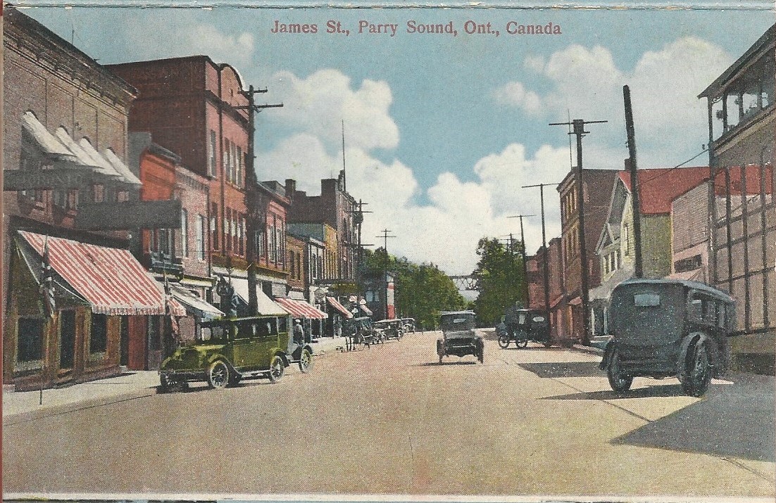
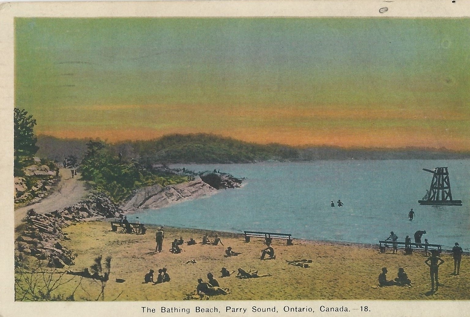
- a colourized black and white photo using a variety techniques that improved over time – starting with hand colouring that involved the B/W photo being taken in Parry Sound, then sent to Europe or Asia for colourization and then subsequently moved backed to Canada or the US for reproduction. These cards have a slightly waxy feel to feel to them and often have blurred colours. Some of these cards were printed on Linen and feel more substantial than their B/W ancestors. They would generally belong to the “Chrome” period of Postcards. From the 1900s to the 1920s.
- a second form of colourized black and white photo that utilized an early mechanical lithographic process that would initially have been manufactured in the United States but by the ’40s or ’50s would have been produced in Canada. These cards are a little lighter than the Chrome age cards, are shinier and it is easier to see more detail on the photographs. They would belong to the “Modern Chrome” period of Postcards. From the 1920s to the early 1960s.
- then a final move to a reproduction of colour photographs to colour postcards using a series of rapid technological printing advances. Production techniques with registered names such as Plastichrome, Aultone, Collotype, and ColourPicture point to a rapidly changing, technology focused industry. From the 1960s to the 1990s.
Our colourized black and white cards were likely produced from the turn of the century to the late 1950s. This process, particularly in the early decades of the 20th Century, allowed for great artistic creativity and as a result I suspect no special significance should be given to the choice of colour on an Downtown awning or the roof of a building on The Beach. However, the subject matter (the people, the buildings, the cars etc) likely are quite accurate.
For our purposes it might have been better to stick with the black and white card. Discuss among yourselves.
Finally, other information on the Front of the card (like a description or title) as well as all formatting (title, stamp area, printed border lines, authorship etc) info on the Back of the card would have been separately typeset. Assuming relatively short production runs, this TYPE would have been set by hand and could/would have been manufactured using a simple letter press printing device.