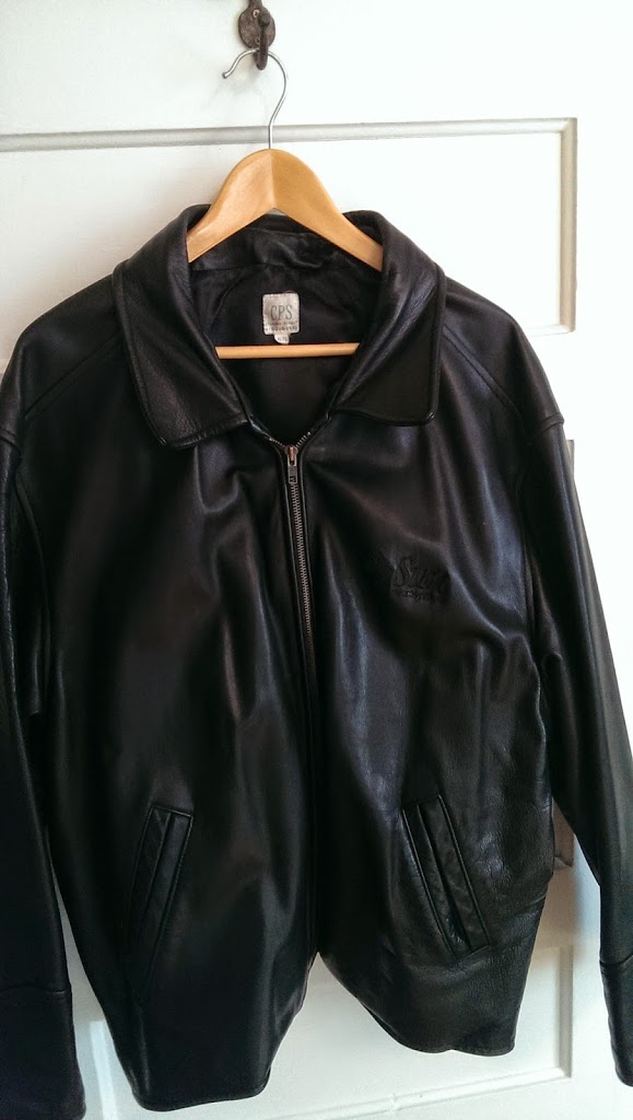
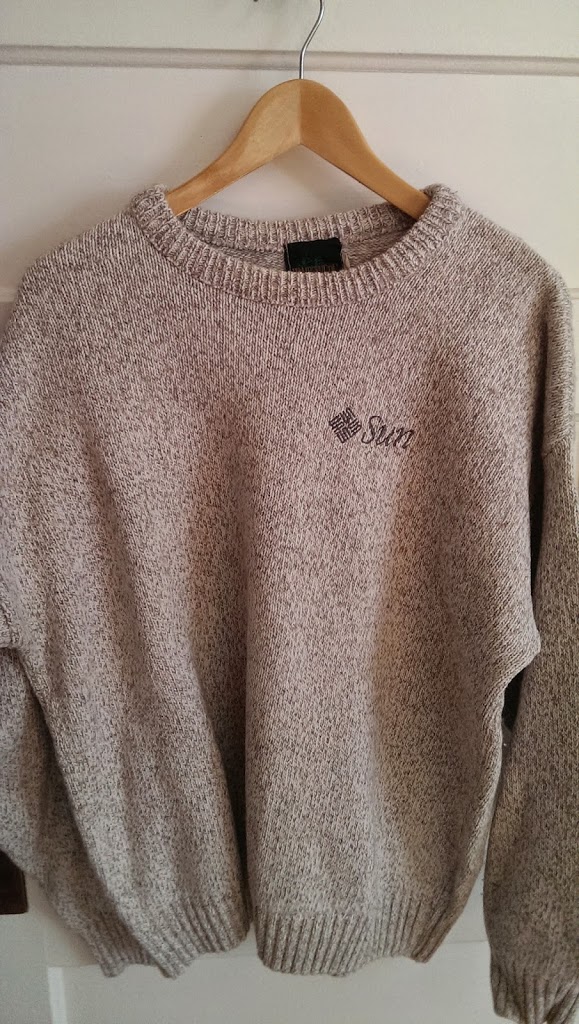
As part of a recent major household clean-up I finally tackled a small project that I had been avoiding. Tucked away in the back of the closest in my home office, on a top shelf, pushed to the corners were several stacks of T-Shirts & Sweaters. They were folded one on top of each other, seemed to be pretty clean but as you’ll see were in various stages of disrepair. Some I obviously liked more than others based on the wear patterns.
During the time I worked at Sun Microsystems (particularly in the early days) many events (a new product introduction, a tagline, a fiscal/quarter kickoff, a big win, a company milestone, a new division launch, a partner/reseller event, a token of appreciation, a visiting delegation from HQ, …) were celebrated with the design, review, production and distribution of a Sun T-Shirt.
They seemed to be given out to everyone, often distributed at the end of the formal presentation of a meeting, before any carousing began and as a I recall always well received. The sales and engineering teams were voracious acquirers of T-Shirts and even the stuffiest of the office types seemed to enjoy getting them. In fact, throughout all of the 80s and most of the 90s it became unusual not have a T-Shirt ready to hand out and if it one was not available it became a mark of an unsophisticated team who seemingly had not had the fore-thought to go through the planning required to make a T-Shirt available.
Now at the most straightforward level these were just T-Shirts. A gift to employees and often to customers and partners. I recall it helped us get lined up under a single theme – “All the wood behind one arrow head” was a popular one for example. I had a (great) manager in the early days who would initially evaluate all ideas based on whether or not you put the idea simply on a T-Shirt. Could you make the idea so straightforward to understand that a few words would highlight the message.
Often these T-Shirts travelled with at a Sun logo to make the the gift a little more acceptable (btw even ignoring the close relationship to a Swastika I still think the logo is quite snazzy), sometimes with a new tagline or a division or product name added to the front or the back, sometimes with more detailed information about an event or program. The quality of the shirts I received ranged from the thinnest fabric and cheapest cut to over the top higher end T-Shirts that likely were not designed for such obvious trinketing. Most often the shirts were silk screened, occasionally they were stitched and in at least one case I know we had custom material made with the Sun Rocket Family woven into the fabric. More on the Rocket Family later.

One area that always caught my attention were the remarkably wide variations and uses of the Sun Logo. For such a great design there were some terrible abominations produced so I’ve taken the liberty of documenting them as well. There was no shortage of internal documentation on how to use the logo appropriately but like many good ideas it stumbled quite a bit on execution.
I think a quick word about the Sun logo culled from the good fellas at wikipedia would be appropriate – http://en.wikipedia.org/wiki/Sun_Microsystems – should set the official tone.
Reality for the logo was a little different.
History of the Logo[edit]
- type 1 – the original logo only with no sun or microsystems (just workstation). The original Sun Microsystems logo, as used on the nameplate of the Sun-1
- type 2 – the shifted bug, lower sun, and no registration mark. Revised logo, sued from 1983 to 1996
- type 3 – upper case S on Sun with a registration mark. From 1996 until 2010/acquisition by Oracle Corporation
-
an hq/corporate shirt that was manufactured centrally, distributed worldwide, and quite often made available to every Sun employee – supporting a big message the company was looking for everyone to get behind – a grand production in many ways – and always a moment
- a local shirt (local to a geography or local a business unit) that was sourced more casually and would presumably be of some interest to a smaller group
Sometimes a T-Shirt wasn’t enough. Golf shirts, Sweatshirts, Sweaters, jackets, socks, underwear and anything that you could possibly stick a logo on were fair game. There was of course an avalanche of other items that you could logoize (new word for google but I like). For our purposes on this blog though – lets stick to the T-Shirts and related items. At the time i understood them simply to be a fun part of working at Sun. They also helped defray my weekend clothing costs.
However, given a little distance from it all, I now wonder if there was a little more to the T-Shirts. They were certainly an attempt to explain Sun to ourselves a bit and to promote to others what we were up to and how we were different. Most obviously it related to areas like dress code that was an visible part of the developing Sun culture.
When I started at Sun it would not have been unusual to put on your 3 piece suit to see a customer, even less unusual to have your customer wearing one. Although, imo, customer’s great couture was not evenly matched by sophisticated IT acquisition processes. They were more likely trapped by legacy infrastructure and legacy purchasing processes they customers are today. The causal wear that was common at HQ in Menlo Park in the mid 1980s and beyond, certainly wasn’t common in the colonies. Could it have been that we were seeking out opportunities to bring a little of the valley to our own world? And were T-Shirts and casual dress an almost accepted way of doing so?
Of course by the early 2000s, discretional spending on things like T-Shirts had all but disappeared and at any rate, customers were much more consistent in what and how they acquired techonology and weren’t distracted by T Shirts one way or the other. Of course by then, everyone was now tuned into the key areas of a maturing industry of low acquisition cost, low operating cost with a very high level of integration and no compromises on business continuity. The stakes were very high a tight logo on a snazzy shirt really didn’t even send an indirect message to anyone.
Now I don’t claim to understand what drove what and I don’t want to overstate the case that T-Shirt production contributed to Sun’s struggles that culminated in its sale to Oracle in 2010 (who incidentally didn’t seem to be awash in T-Shirts). But it does make me wonder sometimes.
At the very least, my partial collection of t-shirts gives a brief snapshot of the topics of the time – what we thought was important. In no particular order lets have a look:
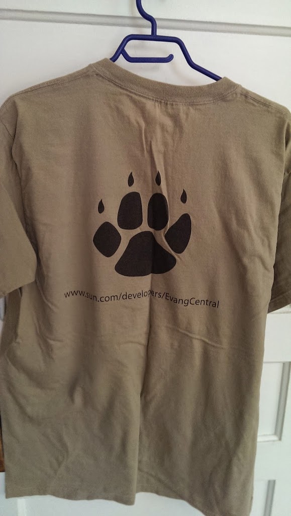
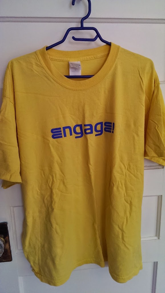
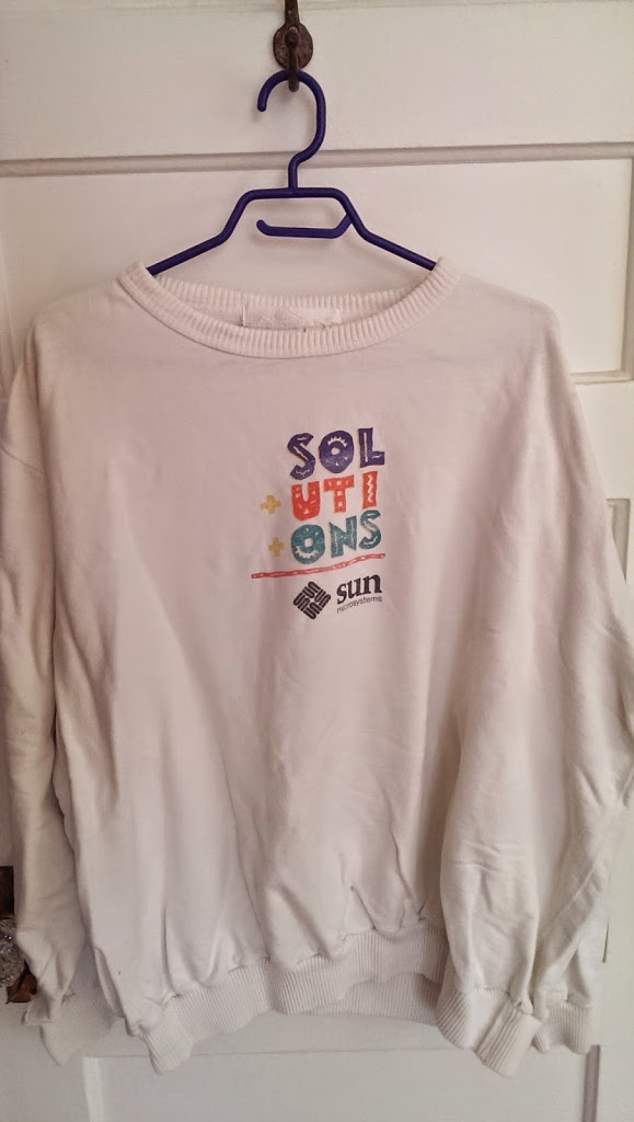
SPARCservers own the Data
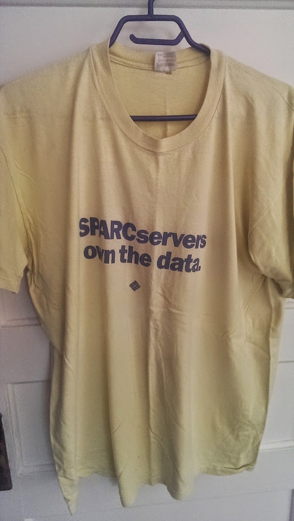
Title: SPARCservers own the data


Colour: a light yellow


Condition: very worn Type: thin fabric, silkscreen


Source: HQ business unit Year: est. 1998


Logo: Type 2 - Sun bug  poorly executed - a logo travesty really for a shirt from hq
Comments: as i recall this was for our first significant Server product launch - likely one of the early Servers built as Servers rather than redeployed desktops without a monitor. Turned into a great business for Sun for almost 10 years. I wore this shirt frequently. I think it fit well.
HOTJAVA
Title: HOTJAVA
Colour: black Condition: mint  Type: heavier weight fabric, silkscreen

Source: HQ business unit Year: est 1995

Logo: no Sun logo, an early version of the Java logo and a steaming hot cup of coffee which would see many variations in the future.

Comments:  an attempt I suspect to distinguish the Java browser from the Java operating environment and Java vm. All this naming of course culminated 15 years later in the rebranding of the entire company to Java. Wild.
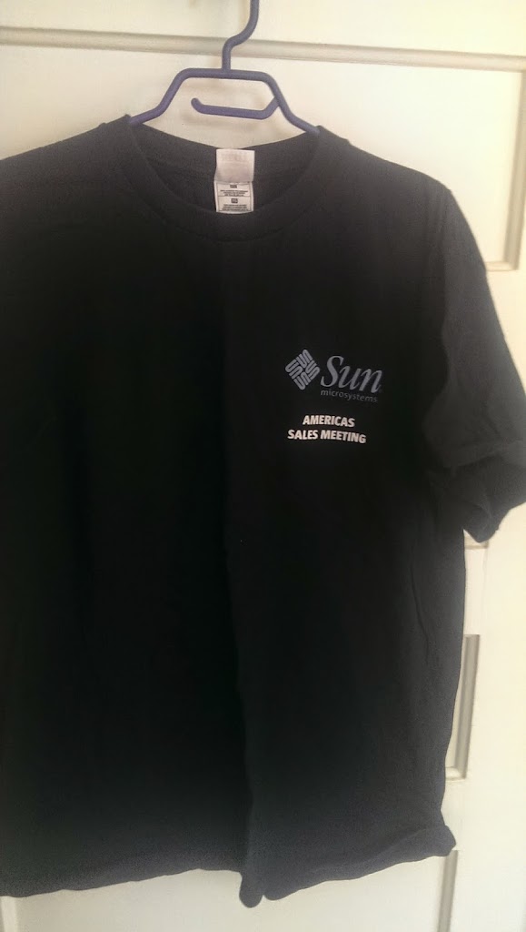
AMERICAS SALES MEETING
Title: Americas Sales Meeting

Colour: black

Condition: mint, silkscreen and stitch for the logo

Type: heavier weight fabric, silkscreen

Source: sales kickoff in the US - Florida

Year: 2006

Logo:Type 3 - looks right

Comments: shirt sponsored by McData (rock your world) in the time honoured tradition of having cooperative marketing $s supporting an supplier event. I recall two things about this sales meeting. It was in July in Orlando and it was incredibly hot and humid, impossible to spend much time outside. Except of course if you went golfing. Which I did at Arnold Palmer's BayHill Club where I shot a hole in one on 14. From the blue pins about 190 yards. As recommended by my caddy I used a 5 wood. Despite the hole in 1 I remain a terrible golfer albeit one with a decent story.
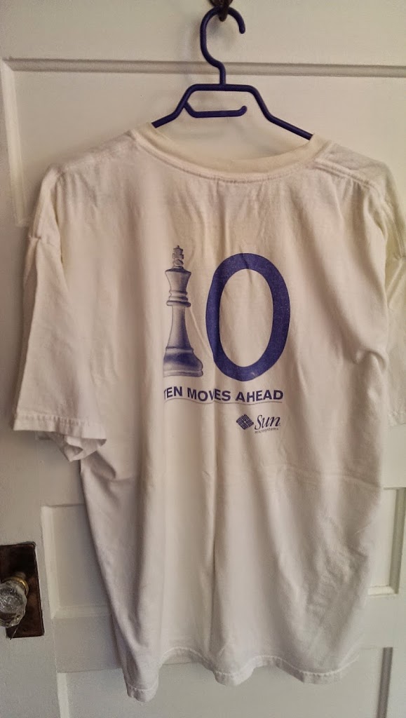
10 Moves Ahead
-
Title: 10 Moves Ahead
-
Colour: white Condition: worn, silkscreen front and back, logo on the sleeve -
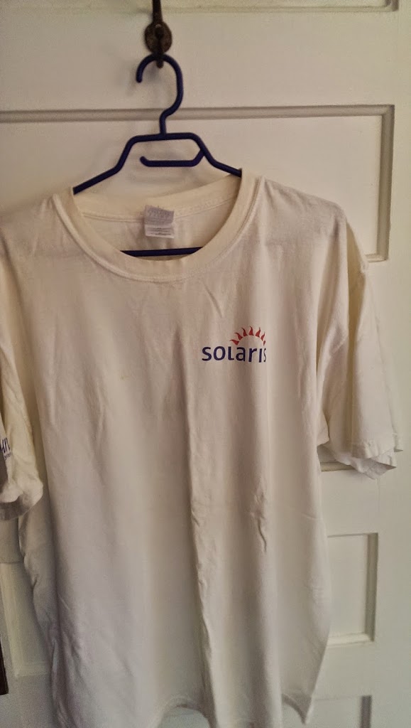
Type: heavy weight Source: HQ, 10 year anniversary of Solaris Year: est 2003 -
Logo: Type 3 on sleeve and on back - looks right -
Comments: Solaris of course was of coursed the well branded and superb Sun operating version of the combined System V and BSD operating systems. replacing SunOS 4.1.x. By this time in 2003 most of the terribly unproductive UNIX battles around filesystems and window systems had passed and were focused squarely on application portfolios. When launched though in 1993 the Motif/Openlook, nfs vs novell, decnet, sna battles were in full swing. It turned out to be pretty simple - Solaris was stable and had plenty of applications. Hard to beat.
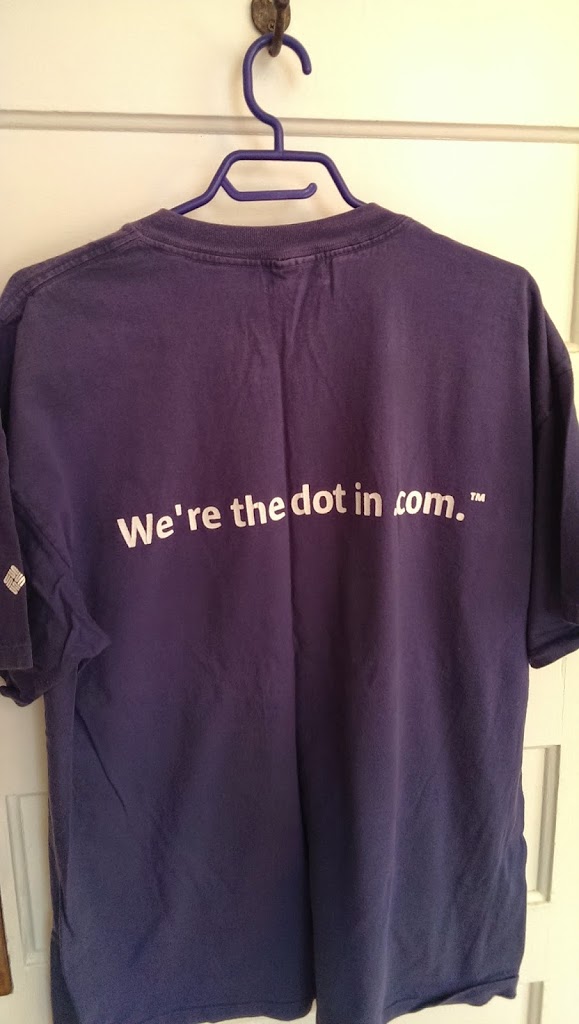
We’re the dot in .com.
Title: We're the dot in .com
Color: purple with white lettering

Condition: worn, silkscreen on the front

Type: medium weight tshirt

Source: HQ

Year: est 1999, 2000

Logo:Type 3  silk screened white logo on purple background - looks right

Comments: I always liked this tagline which I interpreted as a nod to Sun's installed base in the internet web server, security server space. Pretty straight forward or so I thought. I do recall though getting quite a few questions about what it meant - some of them quite shrill. From both the informed and uninformed. It seemed to touch certain people in the wrong way. Partly I guess it was a little on the braggadocio side of the scale and it was also a little confusing at a time when many people were just  figuring out the standard web address structure.

Also,  I was never comfortable with the trailing period have .com on this shirt. I understood the grammar attempt but given that the whole thing was already a little confusing to some it seemed unnecessary.
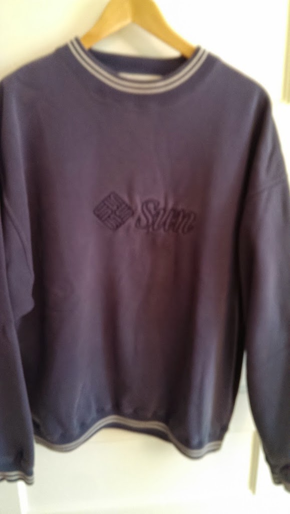
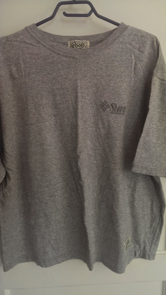
Sun Microsystems
Title: none

Colour: a speckled gray/grey

Condition: somewhat worn

Type: heavyweight tshirt

Year: est 2001

Source: local to Canada

Logo: Type 3 - an attempt at a dark green stitched logo on the left - no registration mark - colour and logo are wrong

Comments: a really nice shirt from Roots (the True Nature of Sports). Actually far too nice a tshirt  to put a logo on to. Also as i recall, quite scratchy on the flesh. Overkill really. No message on the shirt, so we likely had it produced either for a customer gift or for a general all-hands meetings. And if in-fact it was 2001 Sun likely paid too much for this shirt. Still 15 years later it looks great.
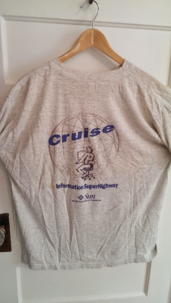
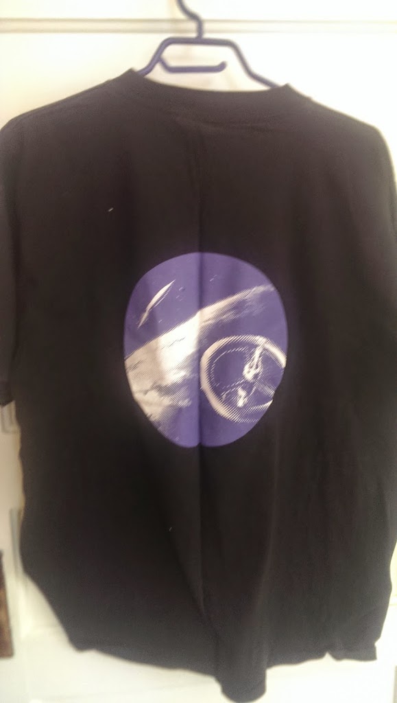
Cruise The Information Superhighway
-
Title: front - none, back - Cruise the Information Superhighway -
Colour: off white -
Condition: well worn with some paint splashes -
Type: lightweight tshirt Year: est 1995/6 (maybe earlier)
-
Source: Sun Canada Logo:Type 2 or Type 3 attempt - no microsystems beneath Sun, no registration market - colour is correct - a hatchet job overall
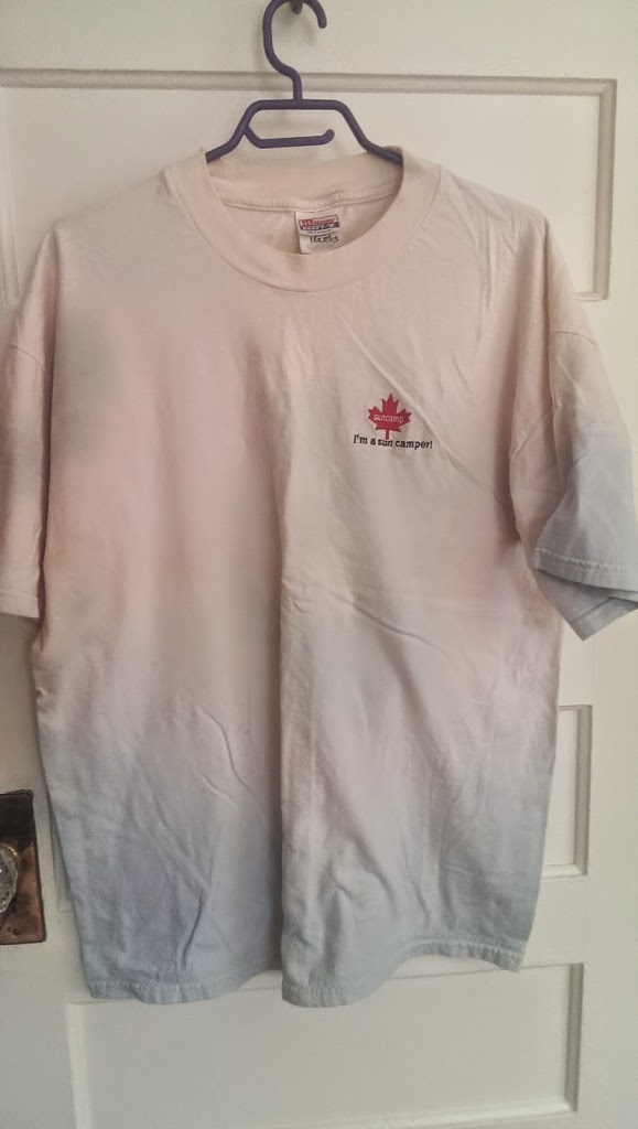
Comments: a another slice of history. No mention of the Internet. The focus was on the Information SuperHighway. A term not seen very often now a days but all the rage in the early and mid 1990s.The image on the back is of a guy (with glasses) sitting at an office desk chair, in front of a computer (likely a Sun Workstation). He is sitting in front of a large circle representing the globe with multicoloured lines connecting the different sides of the globe. He is drawn a little fuzzy, he appears electrified (either actually electric! or maybe excited by what he is seeing), he also appears to have his chair moving. Indicating he is moving to the data rather than the data coming to him (which with hindsight is totally backward).As i recall the Information Superhighway had a broad definition related to communication systems, to telecommunications companies and to governments. In some instances it was more of a proper noun - likely referencing some specific government proposal to build out all the pieces of these systems. From the network transport infrastructure, to the software layers and as i recall all the way to the user devices. I don't recall it being *exclusive* to the Internet and the Web - but perhaps more of a superset.
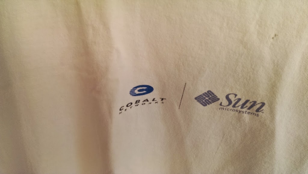
Title: Sun and Cobalt connecting the dots

Colour: White with black lettering on the black and logos on the front

Condition: worn

Year: est 2000

Type: silkscreen,  medium weight tshirt

Source: HQ

Logo: Type 3 -  both the Cobalt and Sun logos look good
Comments: I haven't bothered showing the back of the tshirt. Essentially a happy face with Cobalt on the top left of the face and Sun at the top right. A rush job by someone in accounting (apologies accounting) I bet. Cobalt, a Linux appliance maker, was purchased by Sun in 2000 for $2B. You know what they say. $2B here, $2B there. Begins to add up over a while. A decent overview in wikipedia http://en.wikipedia.org/wiki/Cobalt_Networks . Likely a decent technology and in retrospect something Sun should have figured out how to support much more effectively. Despite the appliance, solution, and Linux chops it brought to Sun - Sun just didn't have the sales and distribution structure in place to make it a success. In retrospect we had a very heavy one trick sales motion - high opex for the overlayed sales team, good discounts (and hopefully margins) for the partner channels, combined with increasing sophistication from our best customer on negotiating end user discounts. Worked for a decade or two in high margin product sales - but very difficult to use this structure for much lower cost and lower margin products, especially when they were sold one at a time.
|
| Front |
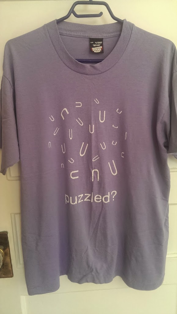
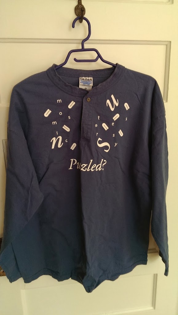
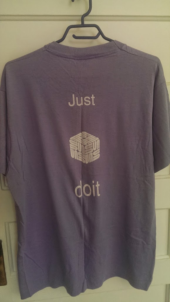
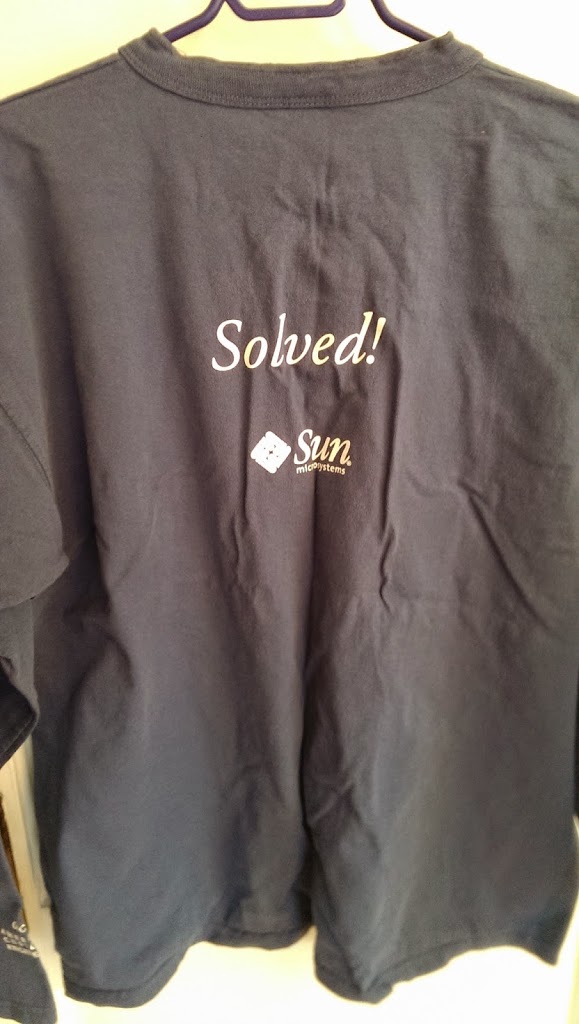
Title: Puzzled? Just Do it.
Colour: Purple with white lettering
Condition: worn
Year est 2000/2001
Type: silk screened, medium weight tshirt
Source: Sun Canada
Logo: really a logo abomination. a custom 3D logo in the 2nd picture logo has been exploded into a bunch of ‘U’s taking advantage of the rather cool Sun logo structure.
Comments: a few more variations below. one in a long sleeve tshirt. The “Puzzled/Solved” front and back works quite well i think.
|
| Back |
 |
| Back |
|
| front |
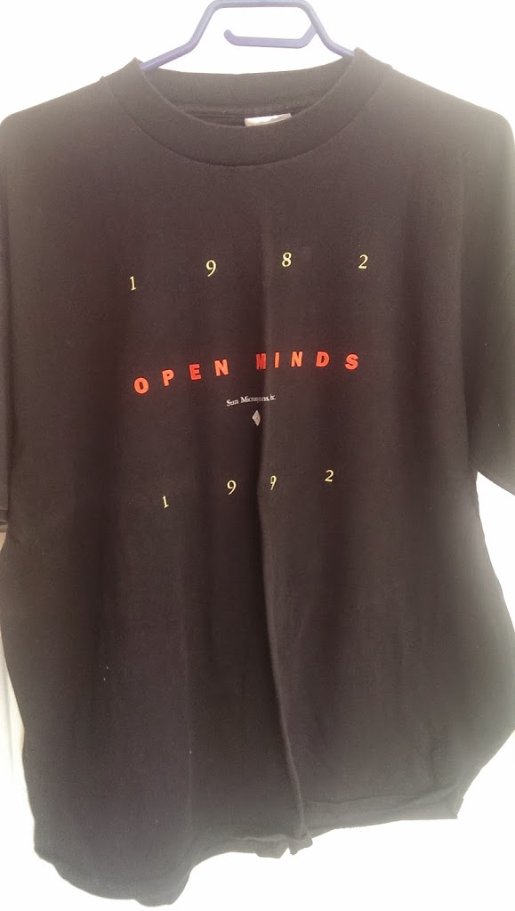
Title: Open Minds
Colour: Black with yellow, red and white lettering
Condition: mint (maybe never worn)
Year: 1992
Type: silkscreen, medium weight t-shirt
Source: HQ
Logo:Type 1 attempt – just the Sun bug no ‘Sun or Microsystems’. Possibly an attempt to acknowledge the original logo first used. But this one actually was diamond shaped rather than square. Also references Sun Microsystems, Inc. rather than Sun Microsystems. Particularly odd imo since this was definitely a centralized effort from HQ and presumably would have had a great deal of oversite.
|
| back |
|
| front |
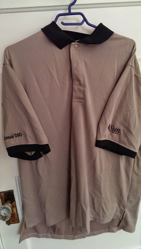
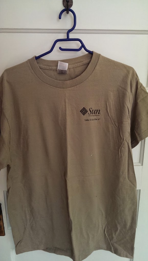
Title: take it to the nth
Colour: light mustardy brown
Condition: worn
Year: mid 1990s
Type: silkscreened, medium weight t-shirt
Source: an hq/global business unit
Logo: Type 3 – black and looks good
Comments: I don’t recall the TLA OSO. I wonder if it was a typo and referred to Sun Canada’s long running and very successfully Independent Sales Organization – ISO. Sales agents for Sun Canada. Maybe somebody knows.
|
| Front |
|
| Back |
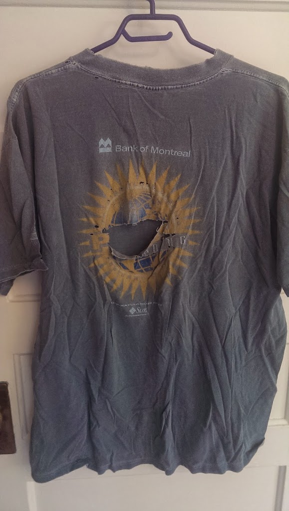
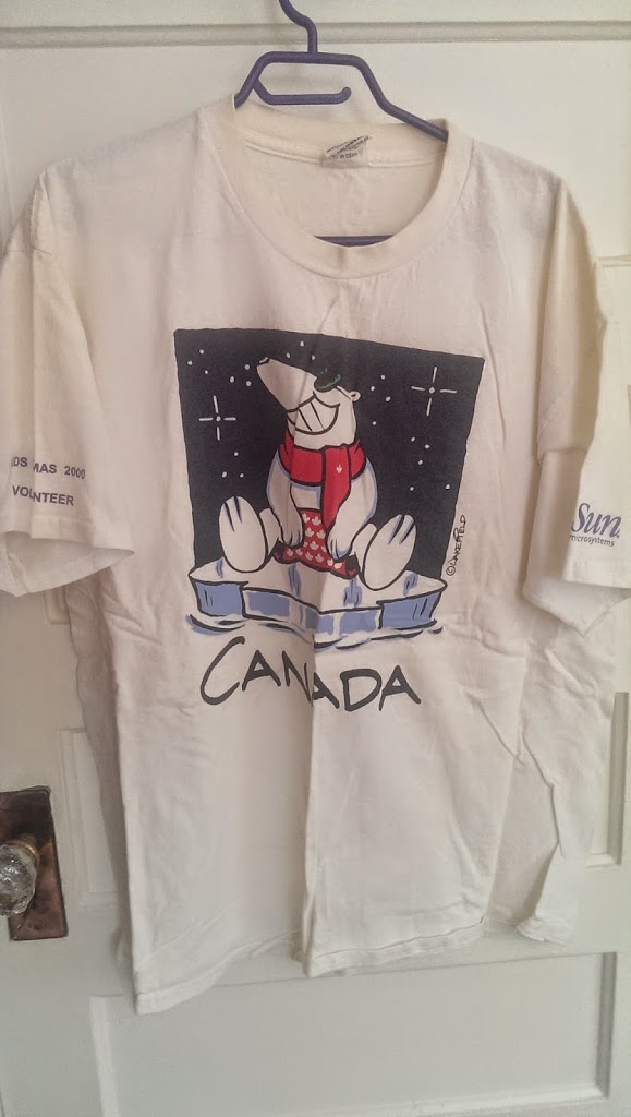
Title: Congratulations from Sun Microsystems
Colour: green/aquamarine
Condition: very well worn with a big hole in the back.
Year: mid 1990s
Type: silkscreen, t-shirt
Source: Sun Canada
Logo: Type 2 or Type 3 attempt – bug + Sun (no microsystems or registration mark)
Comments: a shirt produced for Bank of Montreal employees to congratulate them on their new capital markets trading floor. That was populated with Sun Workstations. Last of the major trading floor upgrades to UNIX in Toronto as i recall.